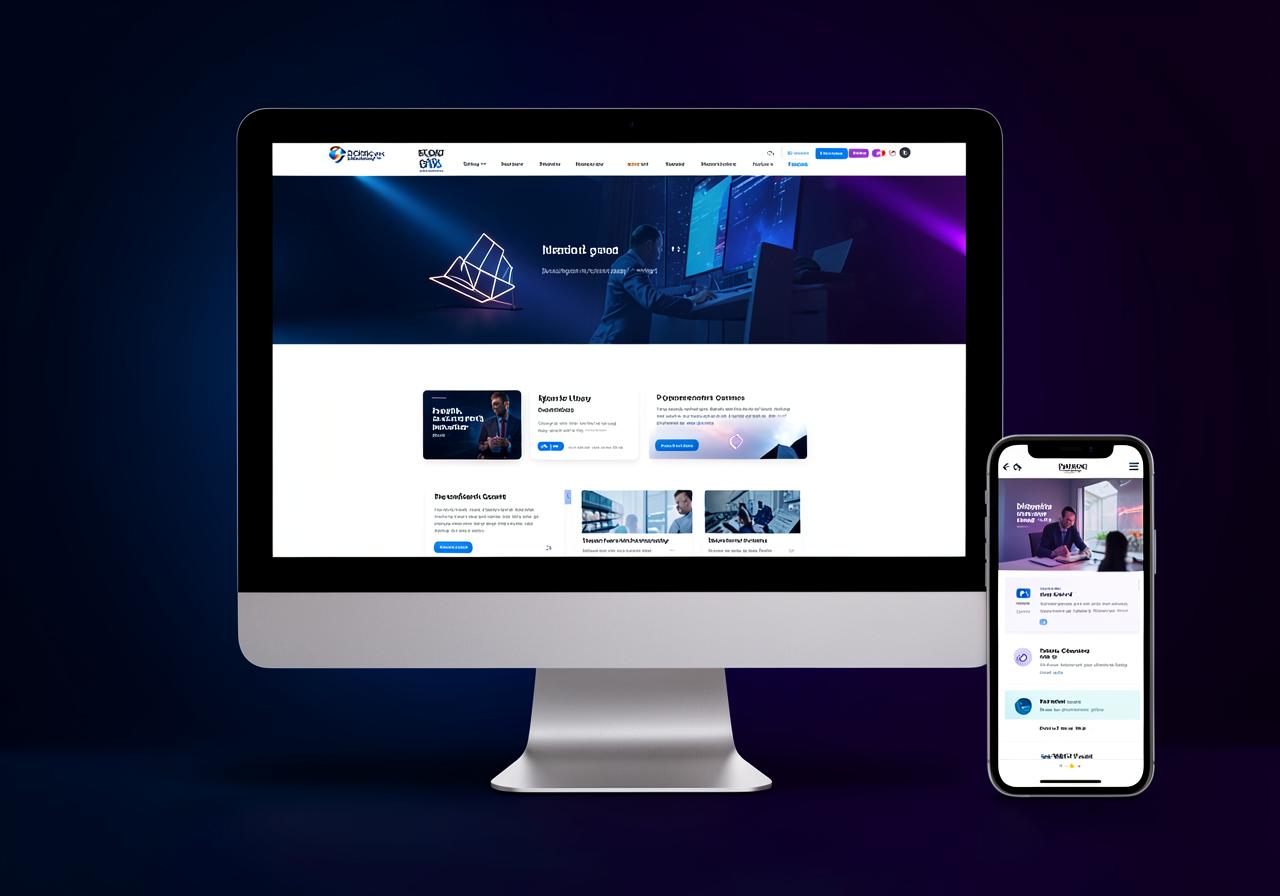
Mobile-first is no longer optional. Here is how to build layouts that stay usable and fast on every screen your buyers actually use.
Most visitors will judge your business on a phone screen before they ever see the desktop version. Responsive design is therefore not a finishing touch — it is the primary layout, and the desktop view is the adaptation.
Start from a single column, set type and tap targets for thumbs, and only introduce columns when the content genuinely benefits. Use fluid spacing and flexible images so the design bends rather than breaks between breakpoints.
Test on real devices and on slow connections. A layout that looks perfect in a design tool but shifts while loading will still cost you enquiries.